3 Letters by Rafid Khan
3 Letters
by Rafid Khan
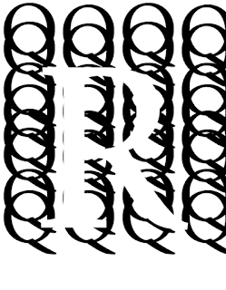
As you can see, this is my 3 letter drawing. The 3 letter I've chose in my drawing is rKo. I would say that my drawing isn't bad at all, however it could've been better if I had carefully used the black Sharpie markers to trace out the letters and the box because I noticed the ink kind of bleeding out of the lines. I also kind of messed up with the letter "o" since I noticed that I wasn't able to draw the letter "o" exactly perfect. Also, my other letters could've been drawn better such as the letter K because I noticed that I stretched out the K at bit long. In other words, I would rate my drawing to be 7/10. You may be wondering why I have picked these three letters out of all alphabet letters. Well, you see, the "r" represents my first name which is Rafid. The "K" represents my last name which is Khan. The "o" represents original aka "OG". So if you combine the letter and the meaning together, you basically get Rafid Khan OG, which shows that I'm the first, real and the best out of all the Rafid Khans that is out there Ig. The stem of the letter "r" is on top of K, the other parts of the letter r is white but it's stem is black because I feel like it would make sense and be accurate enough for it's stem to be black and blend in with the background which is also black. The stem of the letter "r" isn't exactly complete/full but it still managed to be shown. The stem of the letter r is in the bottom left corner. As you may know that the stem of the letter r is also connected to it's serif but it got cut off as I was trying to place the letter r where I wanted it to be. In letter K, it's arm and leg are connected to each other, the letter o is right next to in between the arm and leg. Also, the letter K has feets, I noticed that 2 of it's feet are visible meanwhile the two has been cut off since I was trying to make the letter K big. The letter o is located in the end after r and K, the letter o has the counter which is half shown and half cut because of the box.

.JPG)

I like how your drawing was made well down and precise. However, if someone zooms into it, they can clearly see the sharpie bleeding through the lines. It kind of throws off the drawing but it's not that noticeable unless someone inspects it thoroughly. Finally, I think you could've done a better job erasing the previous pencil marks because it makes the drawing look dirty. I also like how you filled in the ear of the "r" with sharpie and how you left the rest of the letters white.
ReplyDeleteThe letters resembles your name which was a cool thought. The lines look drawn pretty neatly but there are a couple of lines that are a bit off but everything else looks fine. I can see counter on the O, and terminal on the R. I would work on coloring in better because I think you missed the end of the R purposely but it looks good because it looks like it's overlapping.
ReplyDeleteI like how the letters do resemble the model letters and I also liked how most of the letters are outside of the box. The lines are also clearly drawn. What I see happening is that the r is on top of the K and the r is going through the stem of K and C is not near the other letters. Something I would do to improve your design is to try to have less eraser marks on the paper.
ReplyDeleteRafid as you said the o doesn't look too good and for the K you should try to make the line going up more thin. 8/10
ReplyDelete