Posts

Gestalt Letters

Image
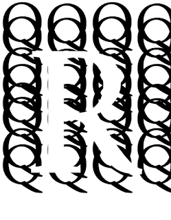
                                                                           Gestalt Letters                                                                            By Rafid Kha This image  is Figure and Ground.  The letter R is the figure meanwhile the letter Q’s is the background. As you can see, the letter R is clearly being perceive with the letter Q’s which is surrounding the letter R. In addition, due the letter Q’s, it can make the letter R perceived as well as visible since the color of the letter R is white meanwhile the color of the letter Q’s is black. Without the letter Q’s, the letter R would be invisible and unable to be perceive. So in conclusion, balancing the letter R that surrounding with letter Q helps perceived equally that it can provide interest and subtlety to the image.  This image is Proximity. As you can see the letter M’s are different from one another due to their rotation but they’re still close together and tend to form as a group while still being differ

Block Set Type

Image
                                                                       Block Set Type                                             By Rafid Khan                    Reflection: As you can see there are three different fonts of  “ICE WATER TURNED ATLANTIC NIGHTCRAWLING PHANTOM HIDE” The methods I used for the words to create  into three different  fonts is based on a song lyrics. I put “ICE WATER” together because if I separated into two different lines, it won’t fit well towards the rest of the type and it won’t be able to express the mood to the rest of the words. I have  “TURNED” in the second line and “ATLANTIC” in the third line. I used “TURNED ATLANTIC” because it’s connected to “ICE WATER”. In this case I use “TURNED” as “referring to”. Furthermore, “ATLANTIC”  is connected to “ICE WATER” because of how  “ATLANTIC” Ocean is known to be very cold and “ICE WATER” is similarly cold as “ATLANTIC” Ocean. I later use “NIGHTCRAWLING PHANTOM HIDE” because I’m trying to change the mood whic

3 letters + word by Rafid Khan

Image
3 letters + word by Rafid Khan   As you can see, here is my  3 letters + word drawing. I would rate my drawing probably around 9/10, it's not a bad drawing in my opinion. However, I feel like my drawing isn't exactly  related to the assignment because it seems that I must've drawn differently from what the assignment was asking. For instance, I was suppose to have some curved letters in my drawing but I don't really have it there. Another thing is the word, I did it all capital  even though it should've been lowercase. In other words, the drawing isn't bad but it isn't really related to the assignment principle. I pick the letters A, i and r because I got the reference/inspiration of a brand  name as well as choosing the word "JORDAN". If you combine the 3 letters and the word together, it's basically refer to as Air Jordan which is a brand name owned by Nike. I choose Air JORDAN as my  3 letters + word  because I like it's products especia

3 Letters by Rafid Khan

Image
                                                                    3 Letters                                                                 by Rafid Khan                                           As you can see, this is my 3 letter drawing. The 3 letter I've chose in my drawing is rKo. I would say that my drawing isn't bad at all, however it could've been better if I had carefully used the black Sharpie markers to trace out the letters and the box because I noticed the ink kind of bleeding out of the lines. I also kind of messed up with the letter "o" since I noticed that I wasn't able to draw the letter "o" exactly perfect. Also, my other letters could've been drawn better such as the letter K because I noticed that I stretched out the K at bit long. In other words, I would rate my drawing to be 7/10. You may be wondering why I have picked these three letters out of all alphabet letters. Well, you see, the "r" represents my first nam

Similarity By Rafid Khan

Image
                                                                                                          Similarity Drawings                                                                           By Rafid Khan Well, as you can see right here, this is my Similarity drawing. This is a good drawing but I wouldn't say this is the perfect drawing. I would rate this drawing either a 7/10 or 8/10 because of how I kind of mess up with tracing my drawing with a thin point Sharpie marker. As you can probably tell, when I was lining outside the box, it kind of messed up on it. When I lining with two different lines, in the beginning it got larger but then in the end,  it got smaller. No matter how careful and focus I was with tracing my drawing with a thin point Sharpie marker, I somehow still managed to mess up at somewhere in my drawing. Oh god, this is like every artist's nightmare when it comes to drawing into a final draft. Anyways, you might be wondering how I managed to draw li

Grid & Structure by Rafid Khan

Image
                                                            Grid & Structure By Rafid Khan                                                                           Reflection  So here is my drawing of grid & structure. I would rate my drawing as 10/10 because even though the drawing is pretty basic/simple, I like the fact of how well I designed it with the colors of black,white and gray. I drew other good designs of grid & structures but I chose this unit form which is triangular grid because of how easy and classic it would take to draw.  Also, I like to draw triangles, when it comes to drawing triangles, I like the directions of the it's structural lines. My drawing  behaves inside of my grid because the triangles creates a pattern of black, white and gray. Each triangles reacts differently in shapes and the background due to the different colors in each box.

Repetition Drawing

Image
                                                                       Repetition Drawing Reflection  So here is my drawing of repetition, I would rate my drawing as a 9/10 because although I've made a mistake of having the inks going out of the line. I still think my drawing is good since I think I did a good job on outlining the drawing and creating a very good pattern on the drawing. I got the idea of drawing this based of a checker board. Like usual, I was thinking of what to draw and then I ended up thinking of the idea of drawing something similar to a checker board. Usually checker board are black and white. However, in my drawing, I decided to create a pattern by coloring with black, white and gray. I acquired/created the repeated image by trying my best to make all the lines in my drawings to be equal or at least similar. I also tried my best not to mess up with the pattern and not ending coloring in the wrong box. The types of repetition I think there is in my drawing are