Gestalt Letters
Gestalt Letters
By Rafid Kha
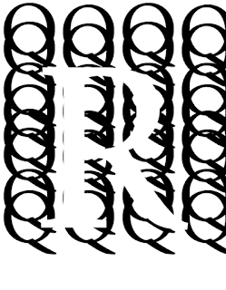
This image is Figure and Ground. The letter R is the figure meanwhile the letter Q’s is the background. As you can see, the letter R is clearly being perceive with the letter Q’s which is surrounding the letter R. In addition, due the letter Q’s, it can make the letter R perceived as well as visible since the color of the letter R is white meanwhile the color of the letter Q’s is black. Without the letter Q’s, the letter R would be invisible and unable to be perceive. So in conclusion, balancing the letter R that surrounding with letter Q helps perceived equally that it can provide interest and subtlety to the image.
This image is Proximity. As you can see the letter M’s are different from one another due to their rotation but they’re still close together and tend to form as a group while still being different. Another reason this is a proximity is because although the letter M’s are group together while still being different, however there is one of the letter M’s that separates from the rest of the group which considers a proximity as it don’t really fit with rest of the letter M’s.
This image is closure. All the letter E’s is in different rotations and are suppose to form together as a giant E. But it’s incomplete and there are spaces that is not completely enclosed. As most of the E’s are there and is indicated, we as viewer can complete the shape based of our perception to complete/fill out the missing piece in this image. When we do our perception of this incomplete image, that’s when closure occurs.

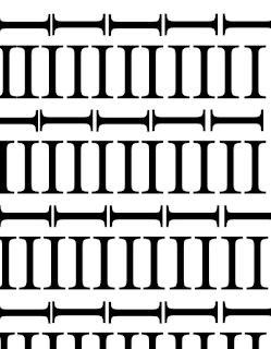
This image is similarity. We have two groups of I: verticals and horizontals. In one row, we have a row of vertical I’s that is similar to one another and then we have a another row of horizontal I’s that is similar to one another. Both of them are perceived as group in each row which shares a pattern. Also, both vertical and horizontal I’s share similarity as they both are the same letters but in a different rotations.
This image is continuation. The letter I goes from one I to another until it stops at the letter W. From perceiving this image, we can see that the letter I is going through/following a loop. It is smoothly following and looping which is leading directly to the letter W where the continuation ends at.


.JPG)


Comments
Post a Comment